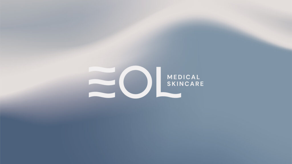
EOL Medical Skincare
Industry
Health + WellnessDeliverables
The story behind the project
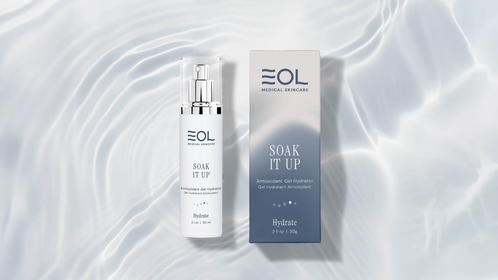
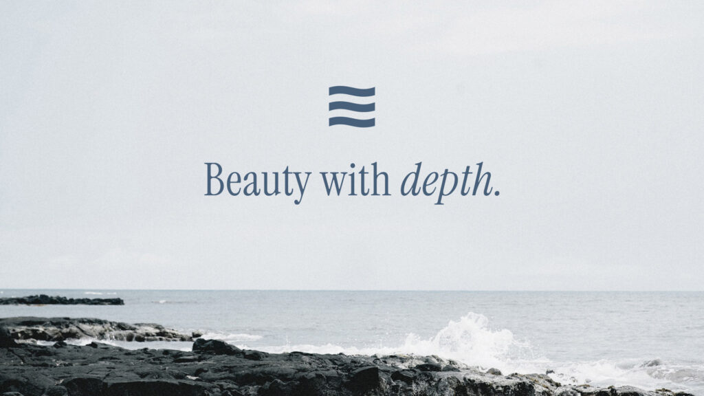
EOL is a premium medical-grade skincare brand built on trusted, in-clinic expertise. As they set out to reach a broader audience across Canada, we helped shape a fresh brand identity inspired by the strength and serenity of water—a symbol of renewal, resilience, and transformation. Drawing from the natural beauty of the West Coast, we developed the idea of a wave of confidence, capturing EOL’s belief that the right formulas can both heal your skin and restore the essence of who you are under the surface. The updated look blends scientific efficacy and the emotional journey of healing your skin, using soft coastal colours, ripple-inspired visuals, and a clean, minimalist design. Rolled out across packaging and digital channels, the new brand brings clarity, consistency, and a more personal touch to every interaction.
A refined brand identity for EOL Skincare, expanding beyond its spa roots to reach a broader market.
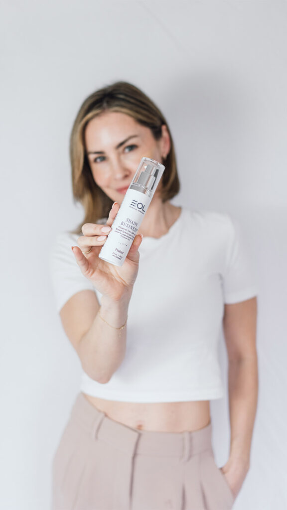
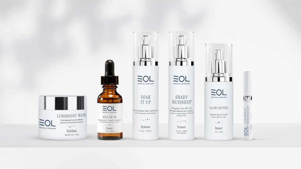
Applied across packaging and social media, EOL’s refreshed branding evokes confidence, elegance, and trust.
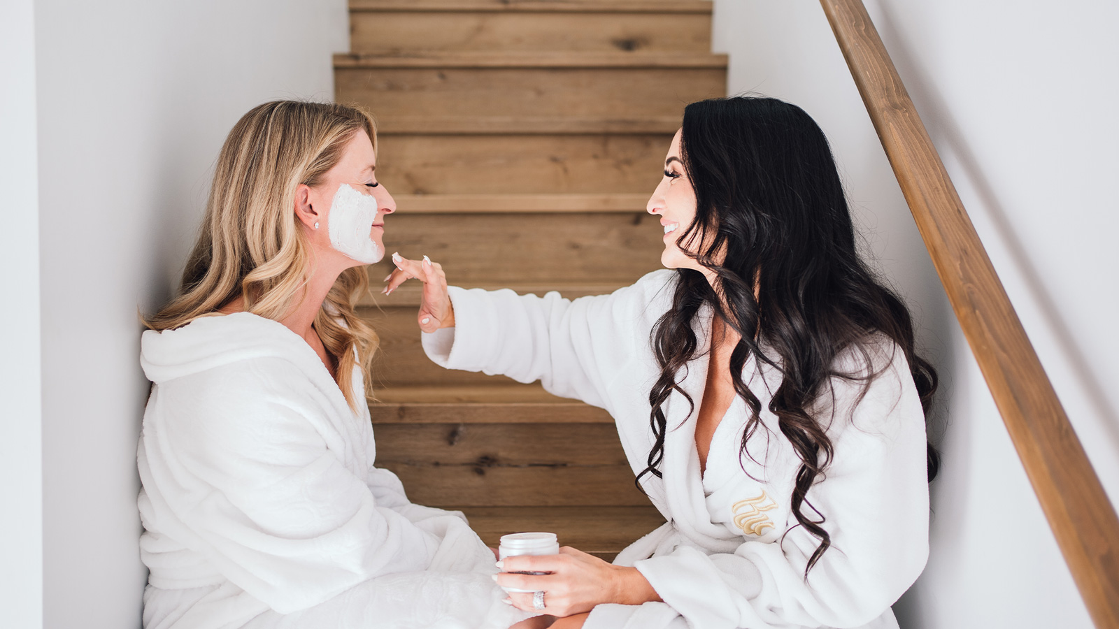
Cohesive social content

similar projects
-
 View Project
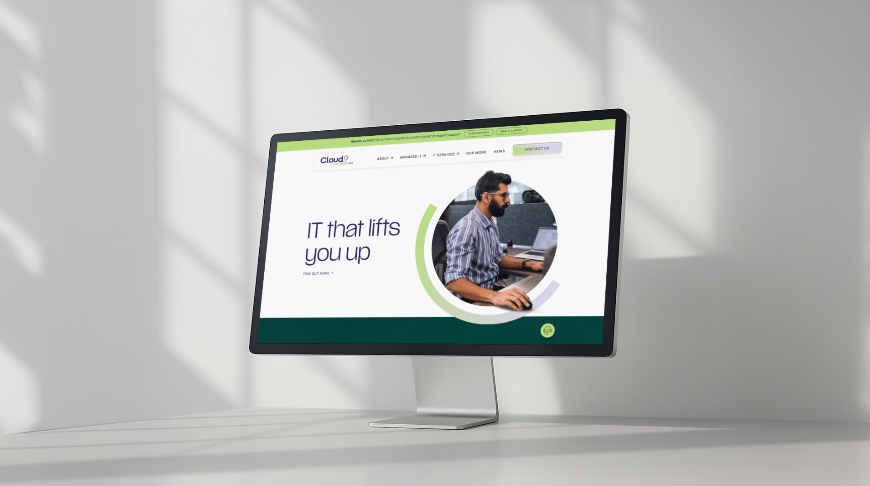
Cloud9 Solutions
Branding, Custom WordPress Website, Graphic Design, Photography, Website Design
-
 View Project
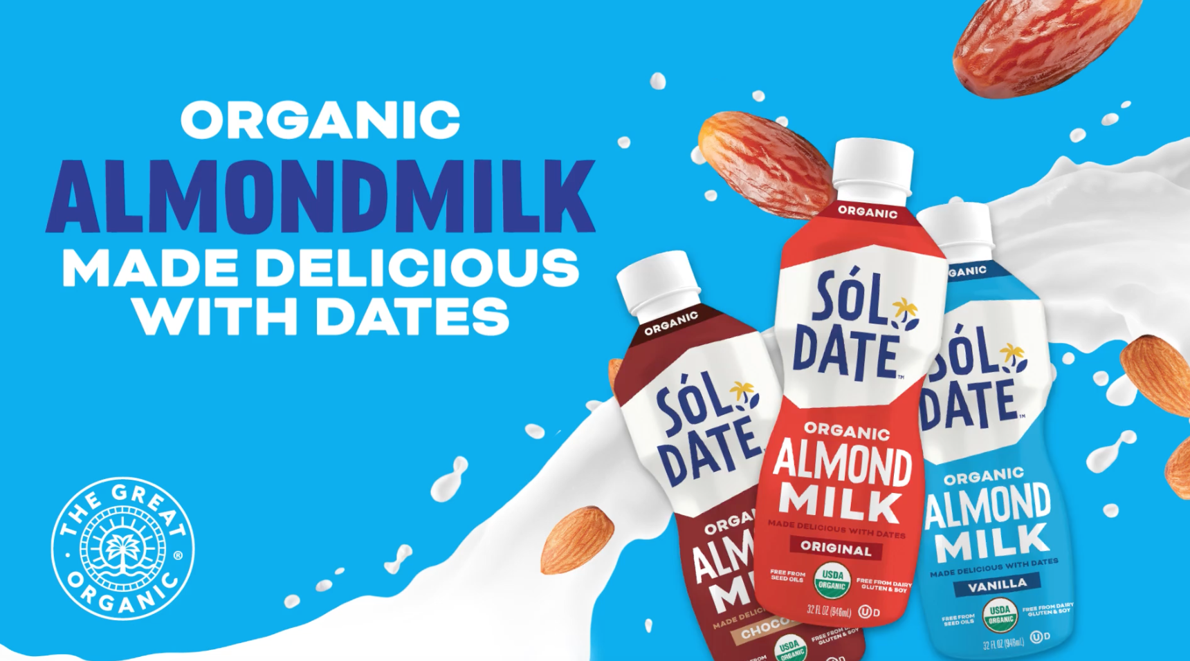
The Great Organic
Copywriting, Graphic Design, Shopify Website
-
 View Project
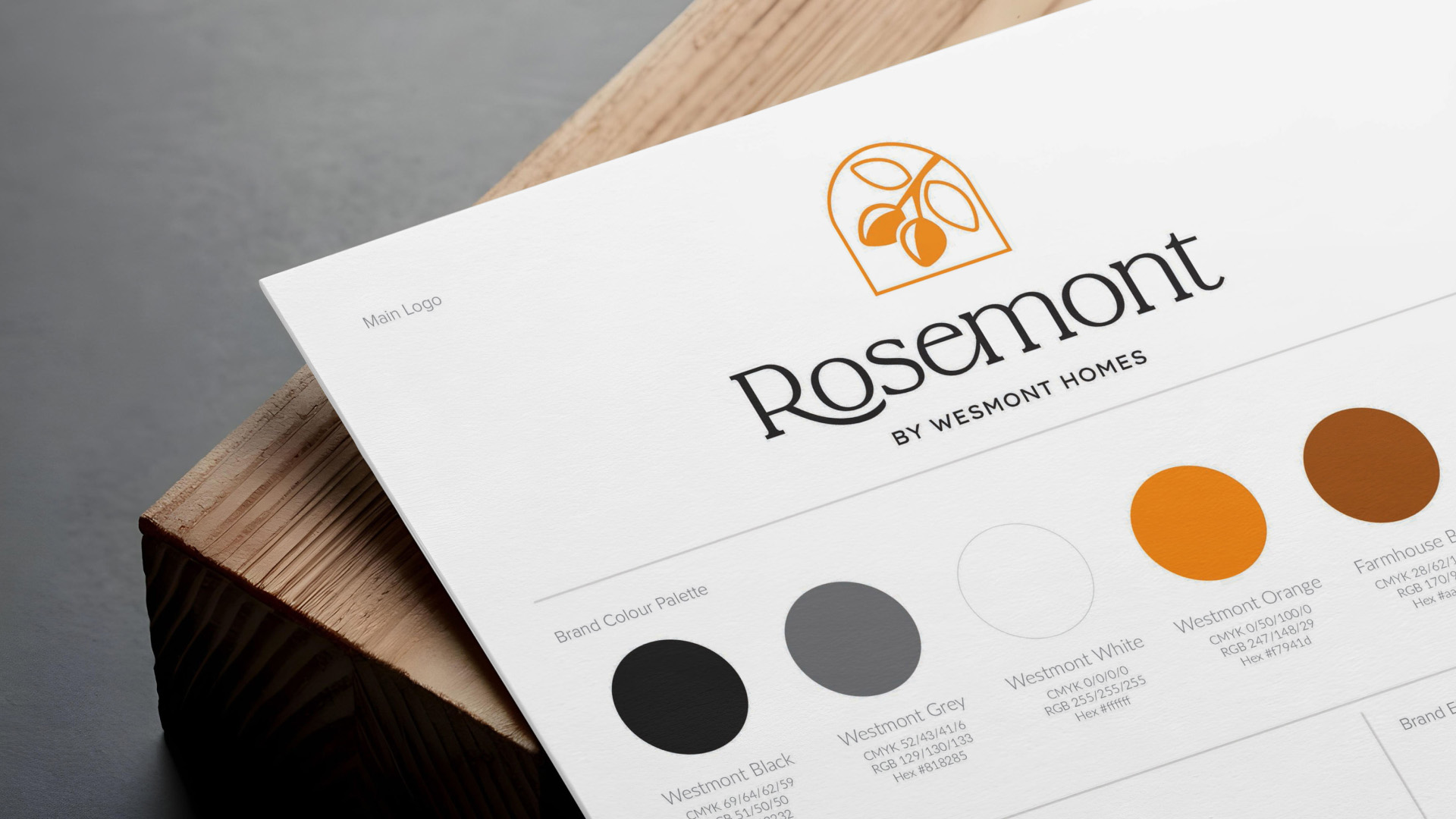
Wesmont Homes
Branding, Graphic Design
-
 View Project
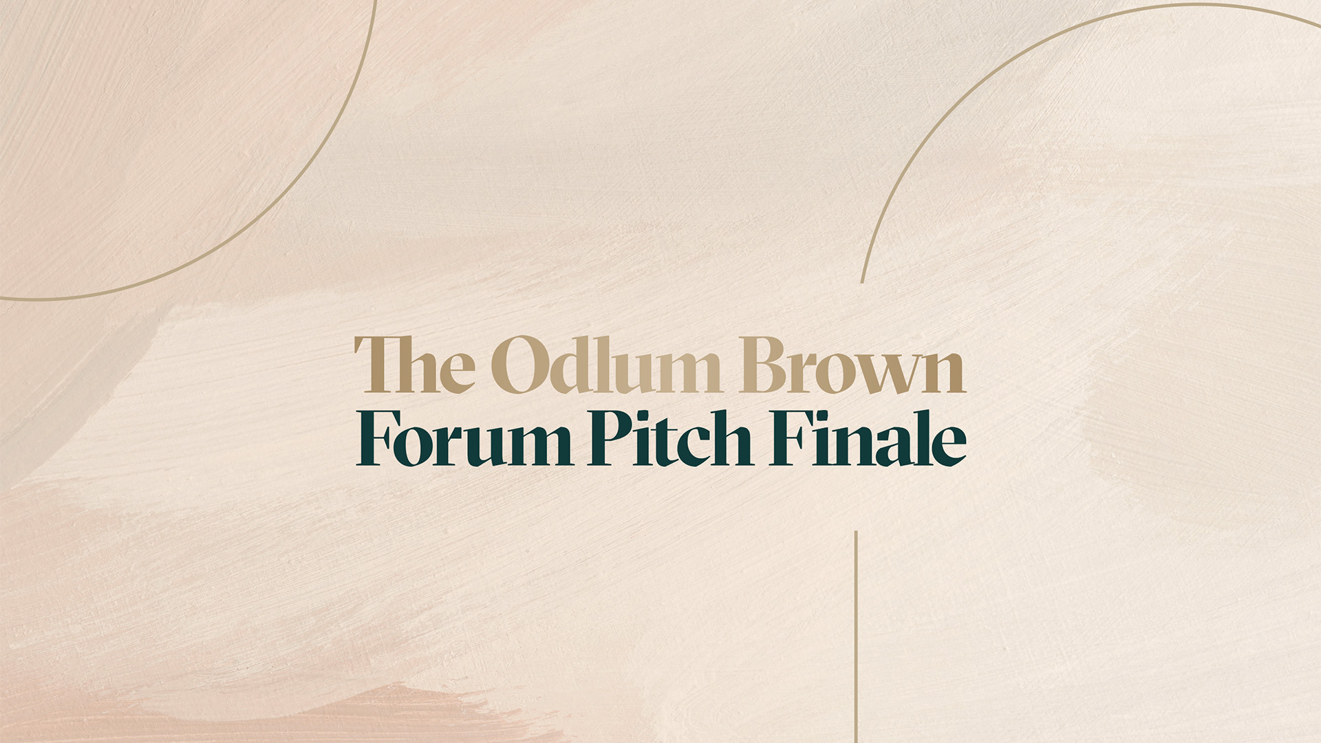
The Forum
Branding, Graphic Design, Social Media
-
 View Project
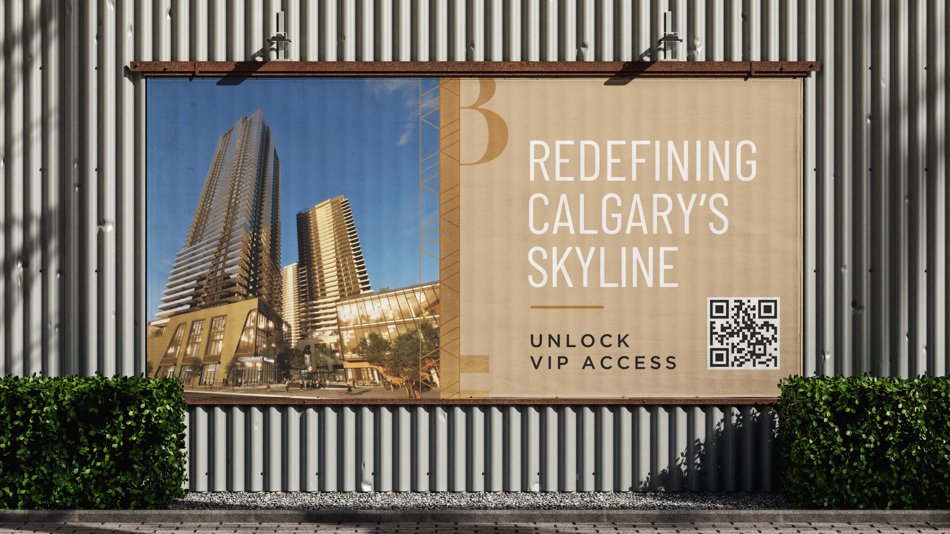
Vesta Properties – Broadway on 17th
Copywriting, Graphic Design
-
 View Project
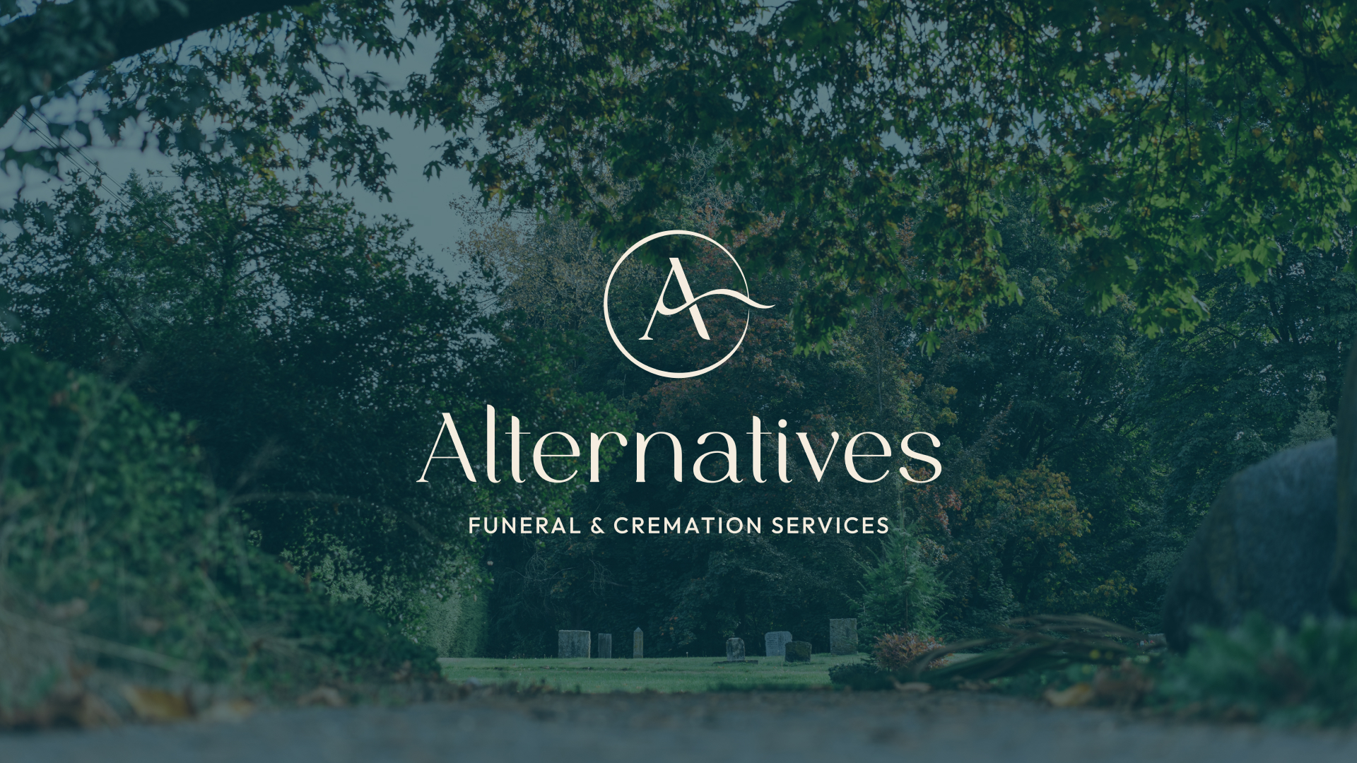
Alternatives Funeral & Cremation Services
Branding, Graphic Design, Strategic Consulting, Website Design
-
 View Project
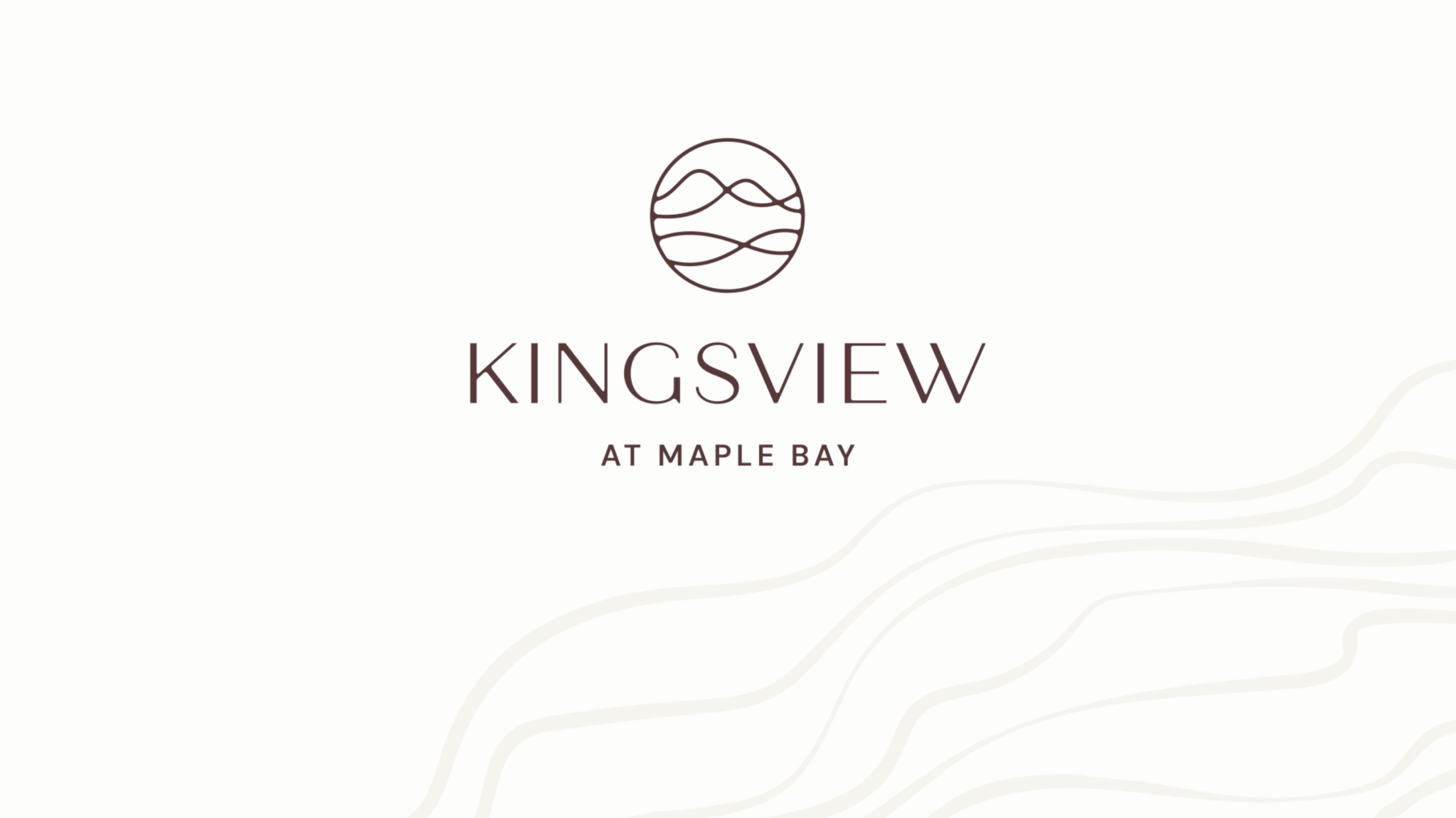
Kingsview at Maple Bay
Branding, Copywriting, Graphic Design
-
 View Project
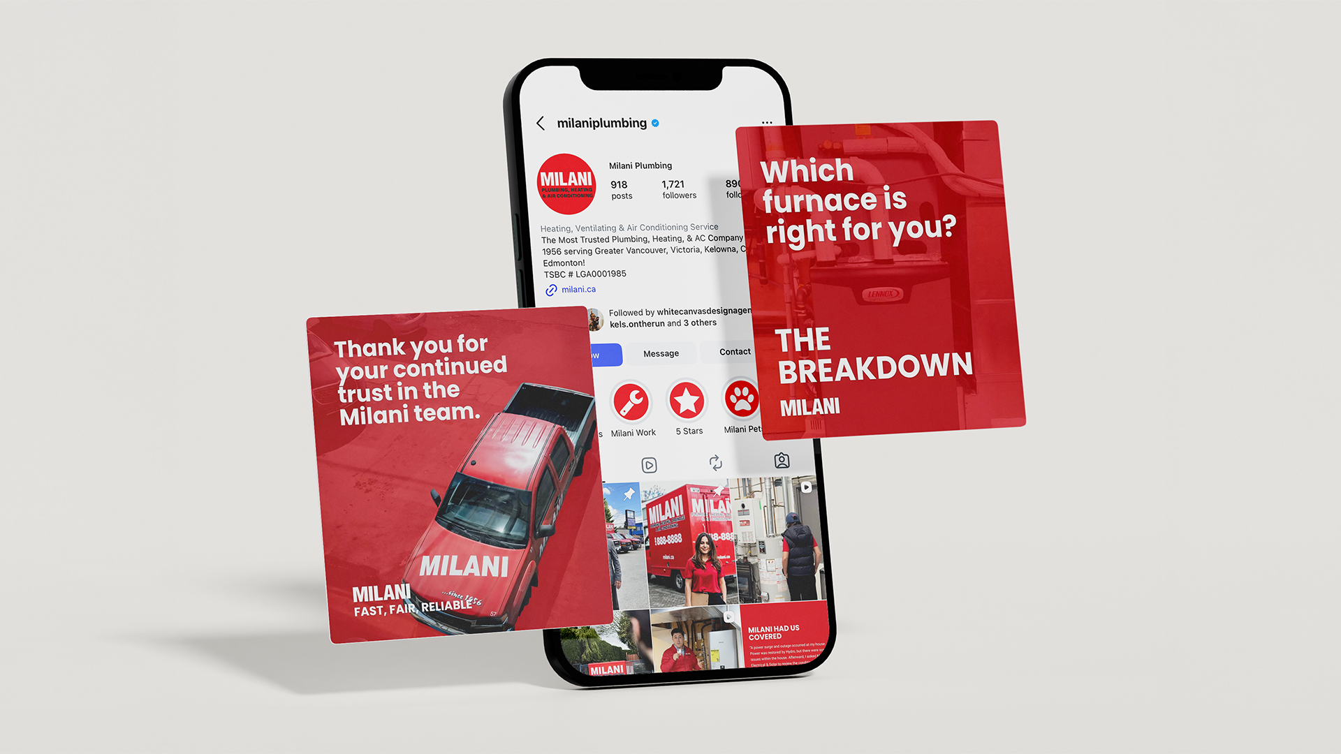
Milani Plumbing
Photography, Social Media
-
 View Project
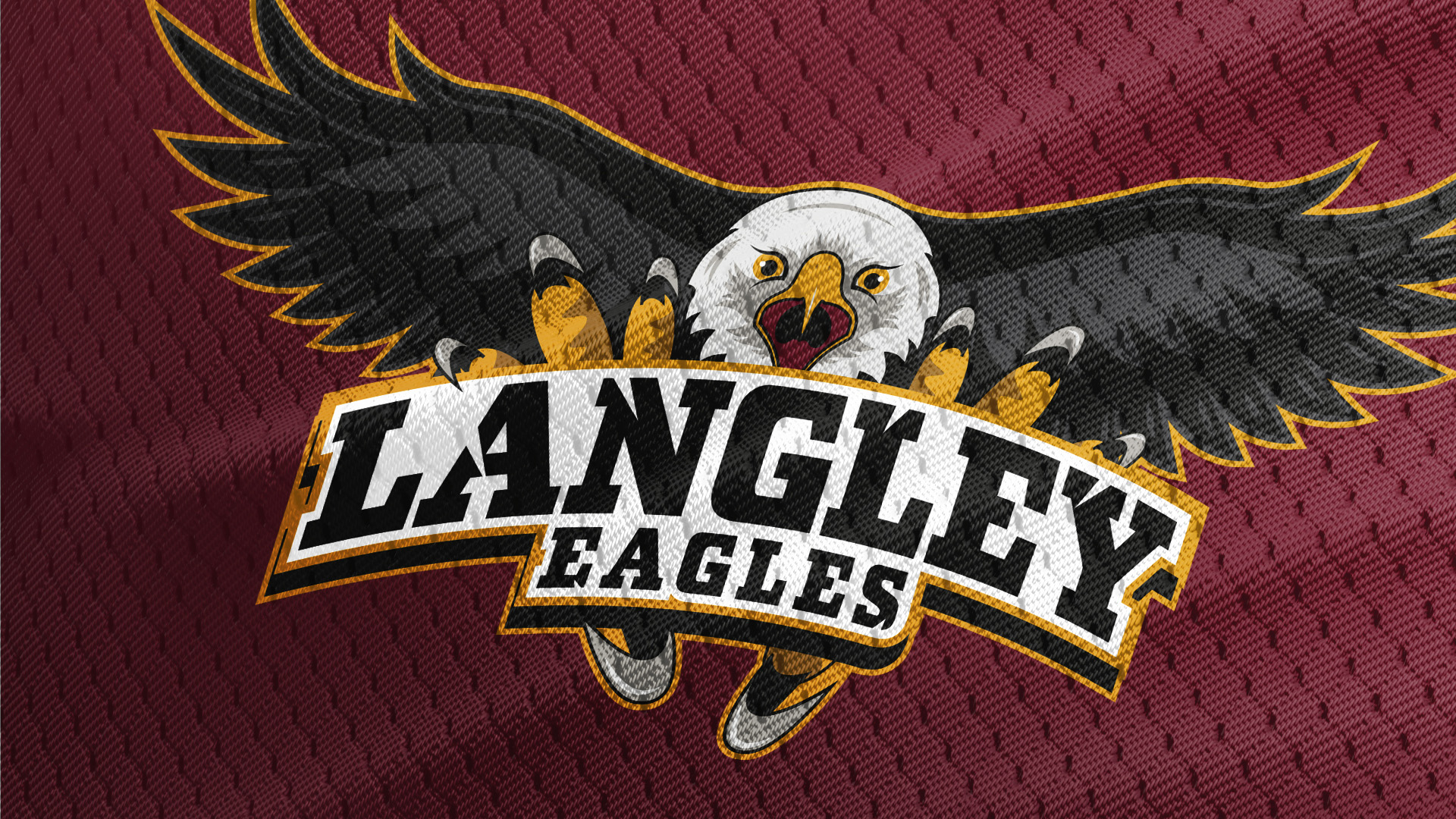
Langley Minor Hockey Association
Branding, Photography, Squarespace Website
-
 View Project
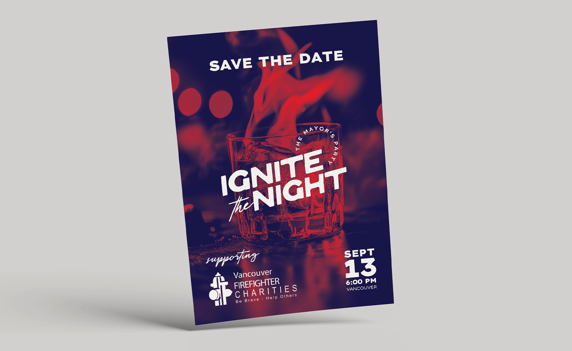
Vancouver Firefighter Charities
Branding, Graphic Design, Squarespace Website
-
 View Project
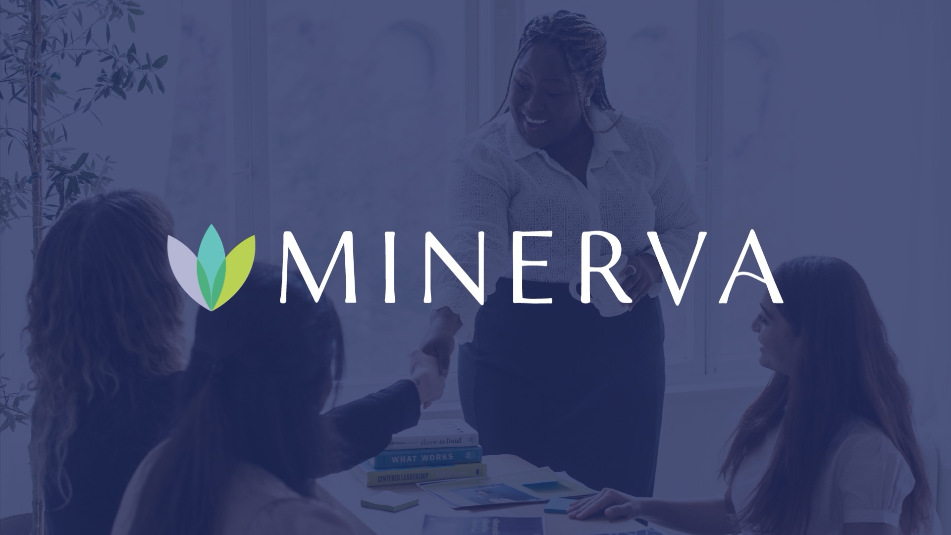
Minerva
Branding, Custom WordPress Website, Graphic Design, Photography, Social Media
-
 View Project
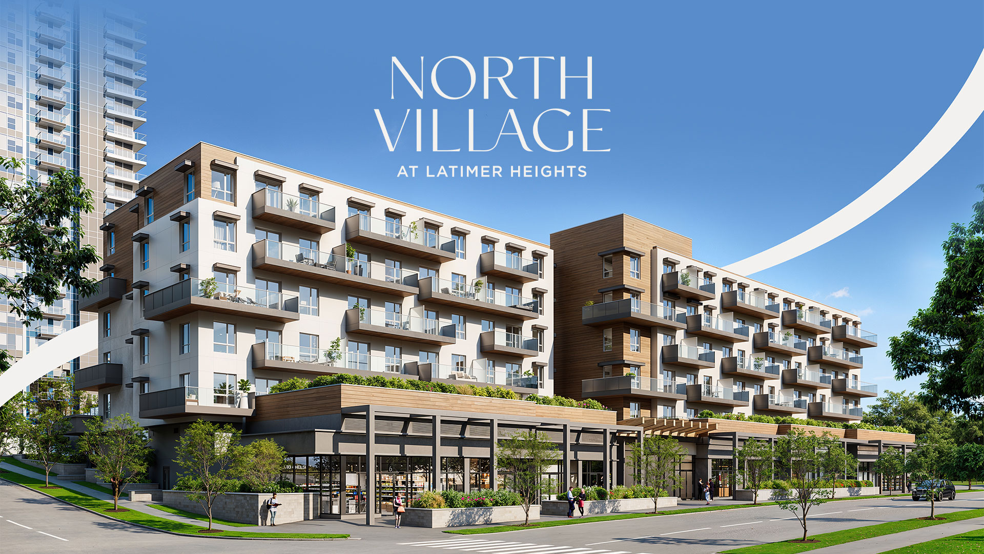
Vesta Properties – Latimer Heights
Branding, Graphic Design, Photography
-
 View Project
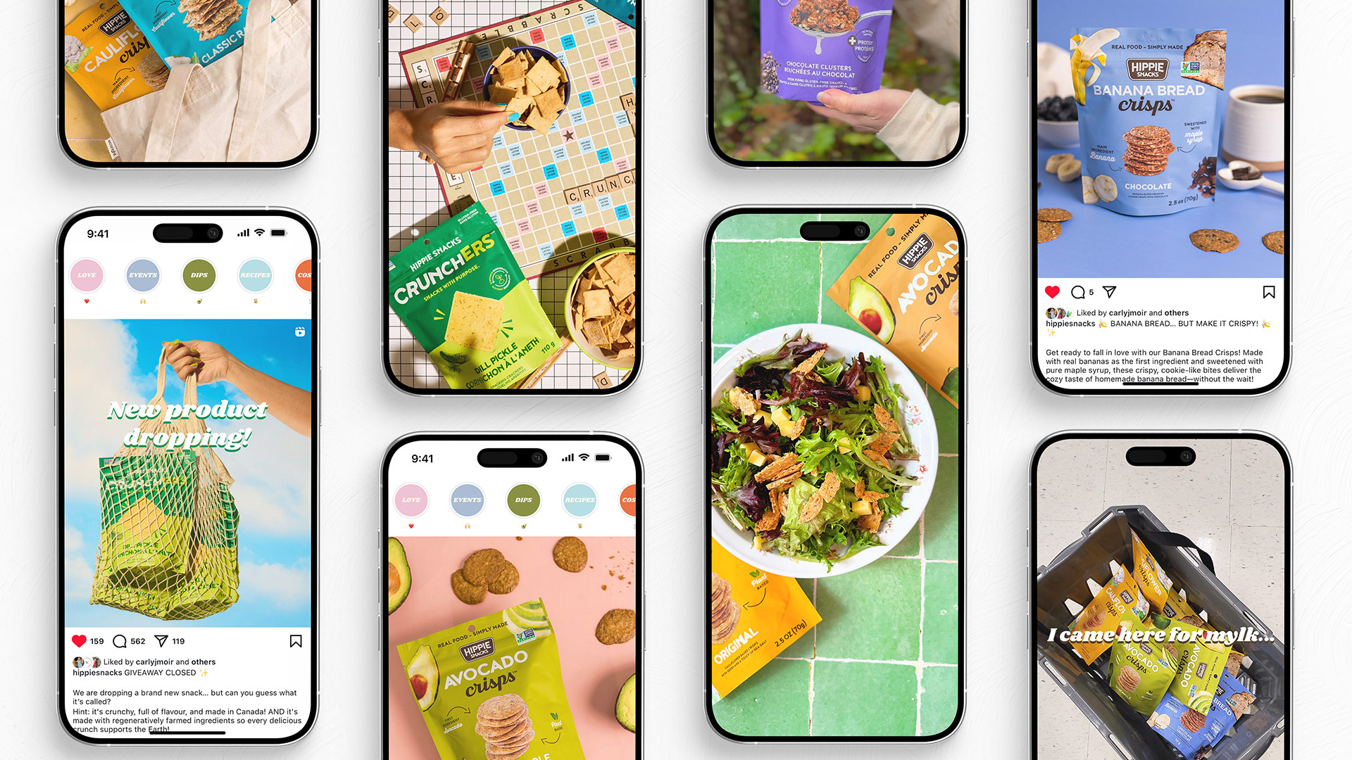
Hippie Snacks
Branding, Custom WordPress Website, Graphic Design, Packaging, Photography, Social Media
-
 View Project
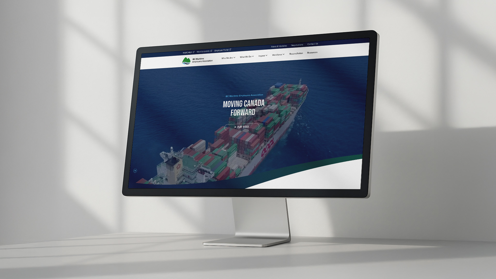
BCMEA
Custom WordPress Website, Graphic Design, Photography, Social Media
-
 View Project
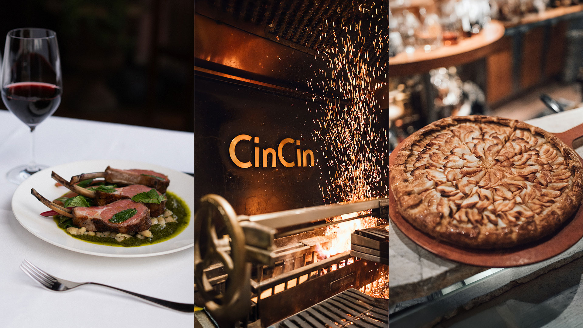
Toptable
Photography, Social Media
-
 View Project
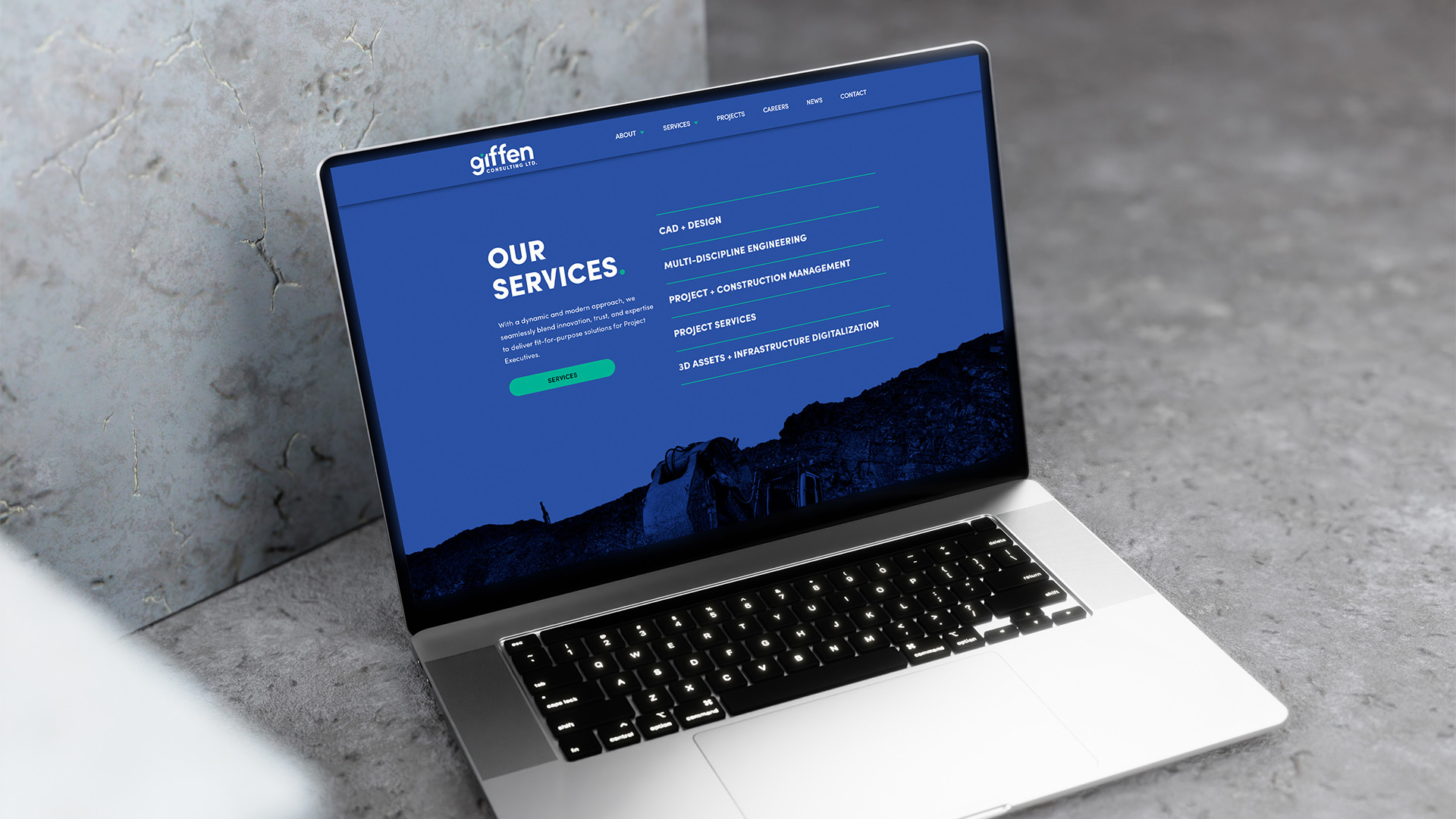
Giffen Consulting
Branding, Custom WordPress Website, Photography, Social Media
-
 View Project
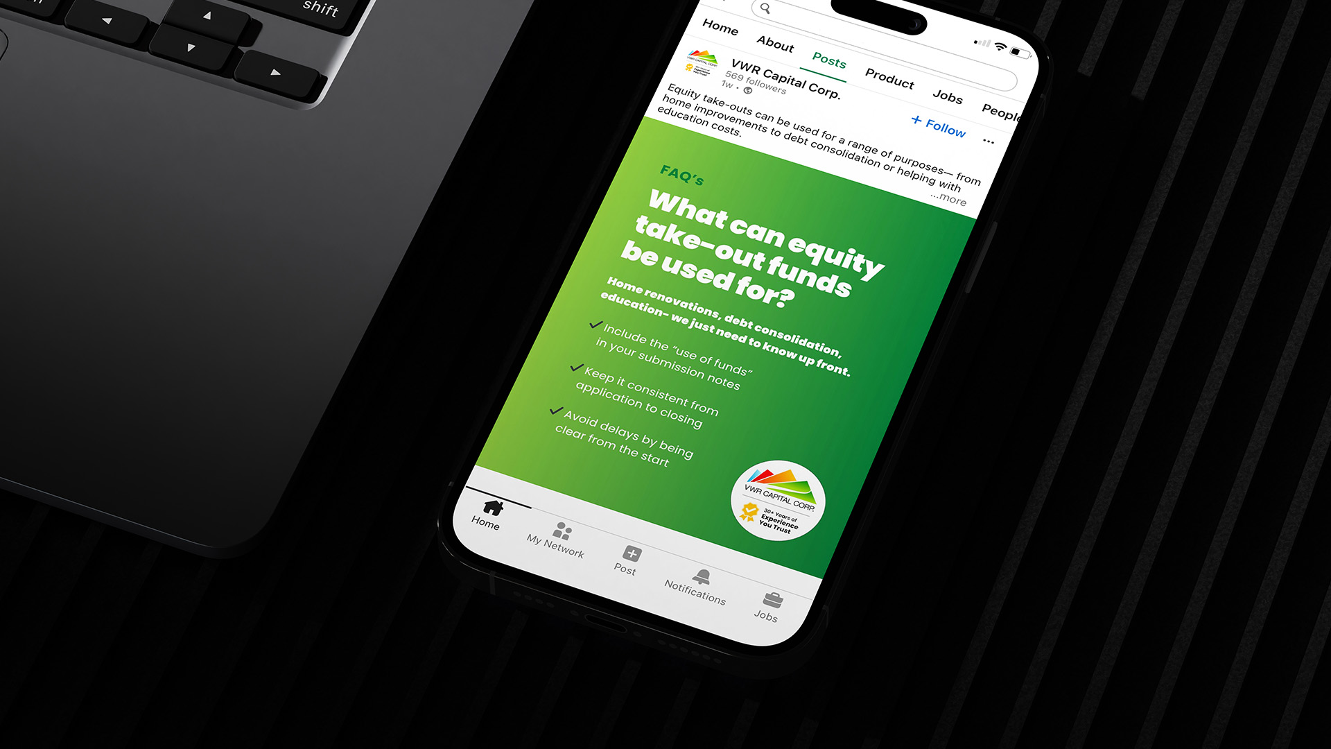
VWR Capital
Graphic Design, Photography, Social Media
-
 View Project
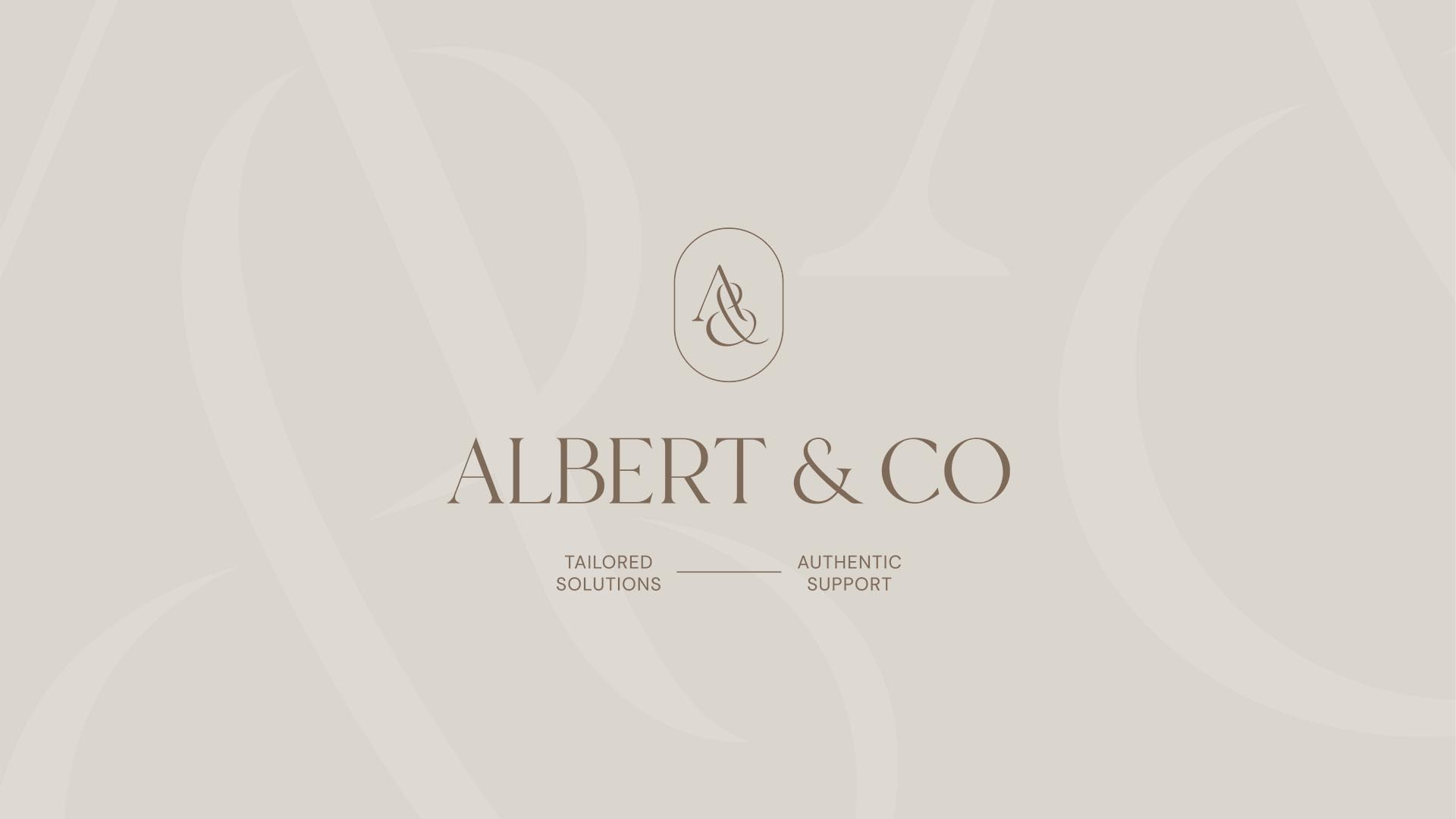
Albert & Co
Branding, Squarespace Website
-
 View Project
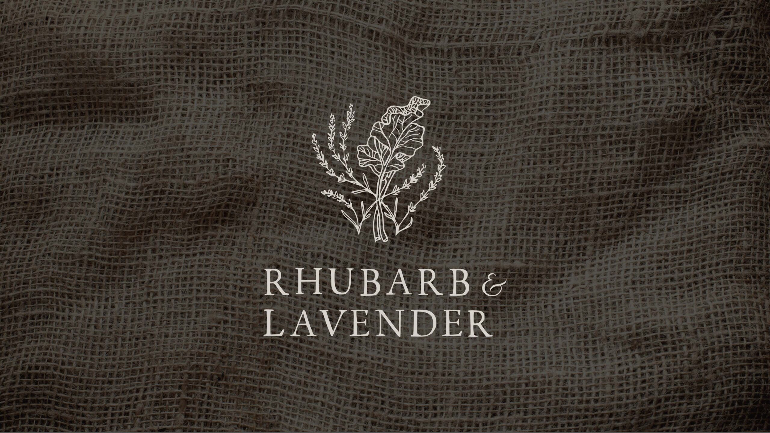
Rhubarb & Lavender
Branding, Custom WordPress Website