Kindred Family Practice
brand + identity
graphic design
squarespace website
Ladner, BC
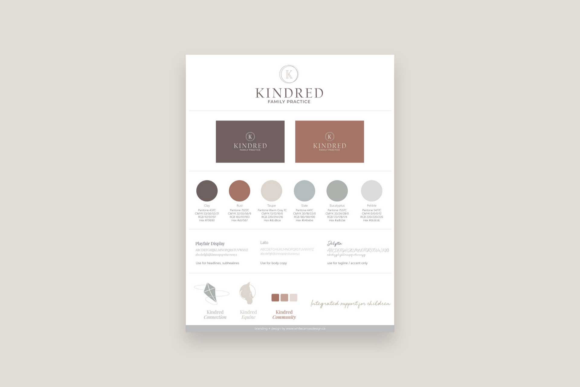
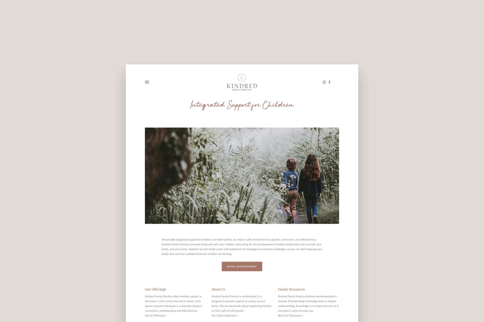
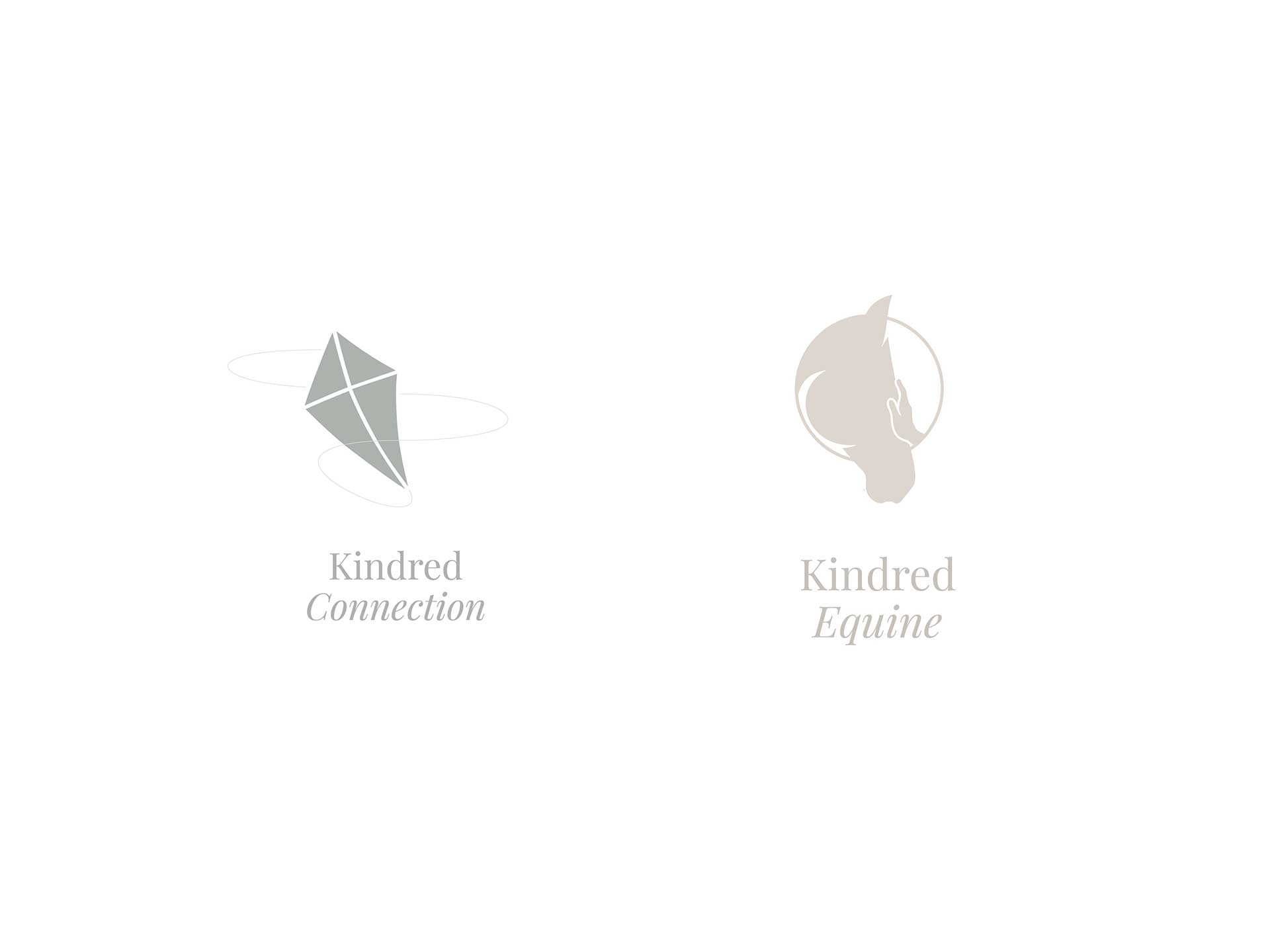
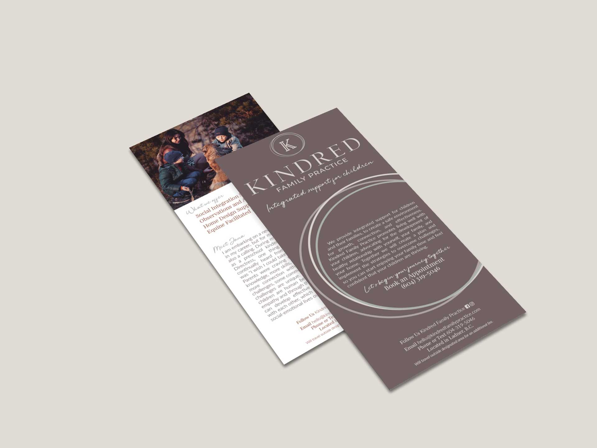
If you're a parent, pay attention here! Kindred Family Practice set our to offer integrated support for children and families of all shapes and sizes, to help them better manage behavioural challenges inside and outside the home. Jana's big vision was brought to us and we knew instantly it was a great fit to bring her brand to life. The rings featured in Kindred's logo represent the 3 core areas of their services, as well as the cyclical approach to their teachings. We created a colour palette that was neutral, inviting, and safe. We chose typography that was sophisticated but still approachable, and expanded their identity elements with custom iconography for their services: Kindred Equine, Kindred Connection, and Kindred Community. We then applied branding to Kindred's new Squarespace website, business cards, and rack card handouts for a completed and consistent look.
Carly met each challenge with grace
Carly took my information back to her team and sent me the first draft for the brand kit a short time later. I couldn't believe she came to such a deep understanding of what I wanted in the project. I sifted through the options and we went through a few drafts to sort out the details. When I expressed my ideas for a little tweak here or a little tweak there, Carly met each challenge with grace. I am grateful for the peace of mind that came from this experience and look forward to tapping into other services that White Canvas Design has to offer.
Jana Luchene, Owner
Kindred Family Practice
