5 things to consider when choosing a colour palette for your brand
We’ve all been there – facing the challenging task of picking a colour for our logo. As we scratch our heads looking through pantone books and sifting pinterest for inspiration, the process all of a sudden seems overwhelming with so many options to choose from. How is it possible that the same design can feel so different depending on the colour we see it in?
Answer: colour psychology. Yep, that’s a real thing. Science has actually proven the effects various colours can have on our emotions and our minds as we interpret them in every day life. Colour has the power to change how we feel about brands and the products they offer. Combine this with rich symbolic references within varying cultures and the formula for the perfect brand colour becomes even more complex. Colour theory will also weigh in, which is the science of marrying colours together without clashing. With these three pillars in mind we have simplified 5 things you’ll want to consider when choosing a colour palette for your company’s brand, with tons of resources for further reading.
1. Consider your target audience
Before you choose your brand palette, you must first know who you are designing it for. Start by defining your target audience, and no, it’s not “everyone”. Pick your ideal customer and think about their age, gender, place of residence, and cultural influences. Research their likes and dislikes. Once you have a primary persona to reference, consider these general rules.
Age: The older we get the more our retinas deteriorate, making it difficult to process warmer, more aggressive colours like red, orange and yellow. If your audience is over the age of 65 you may want to consider sticking to the cooler tones such as blues and greens.
Culture: If your demographic leans towards a particular culture, you’ll definitely want to research the cultural influences and symbolism behind the colour you may be considering. For example in China the colour red is used in weddings and carries meaning of virtue, good luck and happiness. In western cultures, red reflects a variety of things such as anger, love and passion. One colour with considerably different connotations depending on where and how the audience is viewing it. Check out this fantastic colour diagram as reference for colour symbolism across countries and cultures.
Gender: Forget boys liking blue and girls liking pink, science goes way beyond old stereotypes. Studies have shown that men generally prefer brighter more vibrant colours while women prefer softer palettes. In a more detailed study by Joe Hallock (2003), it was determined that blue was both the favourite colour amongst women (35%) and men (57%) while the least favourite colour amongst men was brown (27%) and for women was orange (33%). For further reading on colour theory and gender, check out this comprehensive infographic.
2. Cool versus warm colours
Colours are loaded with energy. What do you want your customer to feel when they look at your brand? What mood do you want to set? A warmer colour palette (reds, oranges, yellows) creates a greater sense of vibrancy, passion, happiness and power. A cooler palette (blues, greens, purples) on the other hand offer notes of calmness, trust, and reliability. Think about what kind of energy is most appropriate for your business to narrow down between cool versus warm categories. It’s also worth thinking about your industry and product/service in a more literal sense and what colours seem to come up organically. A forestry company for example, will have strong colour associations with greens and earthy tones whereas a company that supplies hot tubs may draw upon blues and other water-inspired hues. If you’re a food company or restaurant chain, think about which colours of food naturally appear in your products. Next, consider if you will use a more saturated palette or softer more pastel palette based on your target audience considerations above.

3. Where will your brand palette be used?
It’s important to consider where you spend most of your marketing efforts and developing a palette that is best suited for those strategies. For example if your company invests a lot of money in newspaper advertising, choosing a pastel palette will be difficult to render accurately in this medium due to the nature of the paper stock. Or if you know you will be producing professional packaging down the road, keep in mind you’ll need your pantone spot colour values for most of these kinds of projects so it’s important to communicate that early with your design team. Textures and metallics are also beautiful accents to include in your brand identity, but make sure to consider how your logo will appear when these finishes aren’t available (such as on your website).
4. Colour harmonies and neutrals
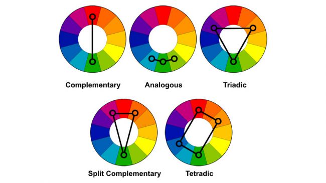
Most brand palettes are made up of 1-2 dominant colours from the colour wheel and paired with complimentary neutrals. For example, our dominant colour at White Canvas is turquoise, while our supplementary colours include lighter shades of our main colour along with cooler grey neutrals. Keep in mind you don’t have to use all of the colours in your palette in your logo design. Typically only 1-2 colours will appear here and the rest will be available for design flexibility in your website and other marketing collateral (business cards, brochures, social media etc.). Ever wonder how your designer comes up with complimenting colours? Primary, secondary and teritary designations come into play, along with creating colour harmonies within the colour wheel. Monochromatic colour harmonies (when the palette resides with one colour in varying tints and shades) is more timeless and classic. On the flipside if we look at complimentary colours on the wheel (think blue and yellow in ikea) we get intense vibrancy from the contrast.
For further reading on colour theory.
5. Research your competition
In order to be different, you need to know what else is out there. Don’t be afraid to research your top 3 competitors to see what they are doing with their brand strategy. Get to know their strengths and weaknesses and capitalize on those for your own visual identity. Sometimes using a differentiating colour is all it takes to stand out from the competition and make your logo memorable. For example if your competitor uses red as their dominant swatch, consider looking at something on the cooler side such as greens or blues. There’s nothing wrong with classic black and white either! Keeping it timeless with shades of grey is making a big comeback for brands of all sizes.
Further reading:
What your logo color says about your company – Fast Company